Lafcadio
  • Mare Limen
  • Rerum Deliciae
  • Stargazing for Beginners
  • Counting the Rings
  • Wildlife Sightings
  • Portland Bridges
  • Dig Your Way Out

Day 32 - Olympic Design

7/28/2012

0 Comments

 
:120728: My captors have designed a new emblem for their international sporting event. I think they could have done better.
Picture
Dear London 2012 Olympics,

Let's talk about your logo. In the bidding process for the 2012 Summer Olympic Games, Kino Design created a lovely image of a ribbon of the Olympic colors weaving through "London 2012" in the shape of your iconic River Thames. It was simple and eye-catching. It clearly stated the city and the year. It had an Olympic feel. It reflected a unique aspect of the host city. It was everything an Olympic logo should be. Your logo for the actual Games, by Wolff Olins, not so much.

I understand that your goal was to reach young people. You probably should have asked some young people (or, you know, people) what they thought of the design. Young people aren't just bright colors and hard-to-read, though it may seem like that sometimes. Young people appreciate good design as much as the next person. Maybe more so. Ugly does not equal young. The BBC ran a poll in which more than 80% of those surveyed awarded the design the lowest possible rating. Maybe that should have been a hint.

There are many directions you could have taken with this logo business.

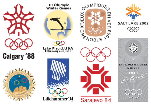
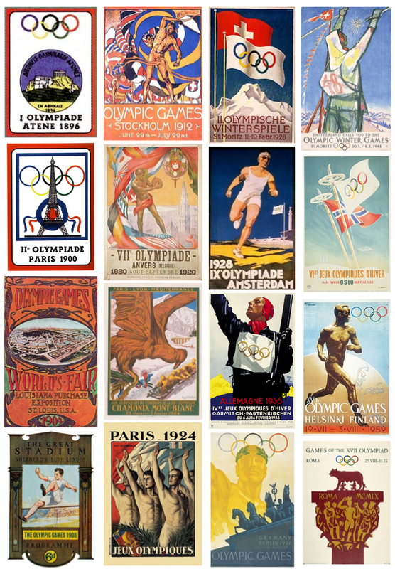
Early in the modern Olympic era, the logos were similar, and though they started out fairly plain, they soon transformed into more poster-like advertisements for the Games. Although not all of them succeed on all counts, most of them are simple, eye-catching, have an Olympic feel, and reflect the host city.

Picture


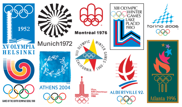
Posters eventually gave way to more logo-like representations of a particular Olympic Games, but for many years, each Games had both a logo and a poster (or several). Often, the posters and logos complemented each other, like your own 1948 Games.
Picture
 

Picture

That's a beautiful logo, by the way. You could have used the exact same logo again, and just changed the 1948 to 2012.

It's been done before.


Early logos were official-looking affairs, all monotone and seal-like. This is certainly the type of thing to be avoided if you're looking to appeal to a younger crowd, and yet the Olympic Games represent more than 100 years of international competition in the modern era. There's nothing wrong with honoring a little bit of history (like you did so well in your opening ceremony).
Picture


Another option would have been to make it painfully obvious that you're the host country. Make the Union Jack the focal point, so nobody can forget the London 2012 happened in the UK. This was the strategy taken by both Los Angeles Games, and two of the three games held in Japan.
Picture


Although it seems easiest to accomplish this with a Winter Games, you could have gone with a motif that represents the season, or a particular sport. Snowflakes, like Sapporo above, seem to be a popular choice. Lillehammer used a representation of the aurora, and though St. Mortiz was a Winter Games, the sunshine seems to work.
Picture
 

Picture
If you were going for appeals-to-youth, there's always the tried-and-true rainbow stylized athlete. I wasn't really a fan of this when I first saw it in Barcelona, nor have I been a fan all of the times it has appeared since then, but it seems to work. Again, we're looking for simple and eye-catching (and easy to read), Olympic spirit (Olympic colors, depiction of athletes, sense of movement), and reflection of the host city. All of these rainbow stylized athlete logos accomplish that.

Picture


A sport, a torch, or simply an abstraction (of strength, grace, movement, power, or an element of the host city). Simple and eye-catching. Easy to read. Olympic spirit. Reflection of the host city. More than one of the above are required for a good Olympic logo.
Picture


But I see what you were trying to do. You wanted the text itself to be the design. Well-designed text can make for an elegant, stunning, simple, powerful logo. But it's not easy to do.
Picture
Amsterdam did alright. Simple, easy to read.

Mexico did it better: simple, easy to read—add eye-catching, sense of movement, and a clever incorporation of the Olympic Rings into the year.

I wouldn't call either of these spectacular logos, but they certainly get the job done. Amsterdam's poster does a much better job (see above).

And yet, with over a century of examples, ranging from excellent to mediocre, you came up with this monstrosity. It hurts my eyes. Animated footage of it triggered seizures in viewers with photosensitive epilepsy. How many people approved the design before it became official?
Picture
It is eye-catching (in that seizure-inducing way), although it takes a while to figure out what you're really looking at.

The city is easy to read, though not capitalized. While in some cases lack of capitalization can look young, hip, and modern—in this case it just looks sloppy.

There is a sense of movement portrayed here, but instead of speed, agility, and grace as one would expect from an Olympic athlete, this movement evokes earthquake aftermath.

There is no Olympic spirit. The year is illegible. There is nothing to indicate the host city besides the word. The Olympic colors are absent. The colors of the host country's flag are absent, too.

It's not pleasing to look at. From a distance, it doesn't look like anything at all.

Now, London, I understand that it was a design firm and not you responsible for this particular design, but it's possible to make your design firm start over. It's even possible to fire your design firm and hire another one. Like maybe the one that did your candidate city logo. That one was nice.

I realize it's too late now, so just know that you've won the gold—for worst Olympic logo ever.
Picture
0 Comments

Day 31 - Just A Little Shakey

3/7/2012

1 Comment

 
:120307: My cell is firmly established on solid ground. Early Monday morning, two strong earthquakes awakened the Bay Area. At 5:33 am, a magnitude 3.5 quake, followed immediately by a magnitude 4.0 quake shook approximately 5.5 miles below the surface in El Cerrito, CA. Another mild aftershock was felt a half hour later.

Though the quakes served as a rude awakening and were felt as far away as Santa Cruz, they were relatively minor. Police dispatchers in the surrounding cities received no reports of injuries or major damage. Nearby transit systems and bridges were inspected and given the all-clear.

My friend, Mac (below) was less than 2.5 miles from the epicenter that morning, and his important job of keeping my mother's feet warm while she sleeps was interrupted by the jolt.
Picture
Earthquakes are a constant threat in the vicinity of the seismically active San Andreas Fault, but individual minor quakes are only as significant as something like a nearby tornado: sure you pay attention to it, but if it doesn't destroy your house or community, you can forget about it pretty quickly. Here it is just a few days later and I bet most people have forgotten it already.

Every once in a while, though, an earthquake is a big deal. Longtime residents of the Bay Area will certainly remember the Loma Prieta earthquake (a.k.a. the Quake of '89 or the World Series Earthquake) as vividly as others remember 9/11 or the assassination of JFK.

The Loma Prieta Quake measured 6.9 on the Richter Magnitude Scale. The Richter Scale is logarithmic in nature, so each whole number is 10 times as powerful as the preceding number. That makes the '89 quake roughly 1000 times as powerful as Monday's quake.

Because of the timing of the event, the earthquake happened during the warm-up of a World Series game, making it the first major quake to have live, national coverage on television. It was also the event that triggered more long-distance phone calls than any other date in history up to that point. Everyone wanted to know if their Bay Area loved ones were OK.

As, of course, did I. My mother (the one whose feet are warmed by Mac) was unable to cross the San Francisco-Oakland Bay Bridge because of the collapsed section, and took a circuitous route around the bay on public transportation to get home from work that night, along with everyone else in the same boat. A commute that normally took about an hour on the bus ended up taking her closer to seven hours.

Before cell phones, there was really no way for me to know if she was going to be able to come home at all that night. As a ten-year-old who had just experienced a major earthquake, it was pretty scary. I stayed at a friend's house that night, as did my brother. We didn't leave a note for Mom, mostly because we didn't want to remain in the high-rise apartment building longer than necessary, but she knew exactly where to find us anyway. She called our respective friends' houses around midnight when she finally got home.

Twenty-two years later, I can still remember exactly what I was eating just a moment before the shaking started. I can remember the underside of the heavy wooden table under which we took cover. I can remember exactly what the shaking felt like. I can remember the color of my friend's socks as we ran down eleven flights of stairs without stopping to put on our shoes. I can remember debating whether to continue walking to my friend's (one story) house in just our socks, or to risk going back inside for shoes (ultimately, we decided to go back inside for shoes and to rescue the cat). I can remember the exact clothing items I had to borrow from my friend to wear to school the next morning. I can remember looking around at the empty desks of my classmates the next day, and hoping that nothing terrible had happened to them.

And I can remember swapping where-where-you-when? stories for years afterward.
1 Comment

Day 30 - Neil DeGrasse Tyson Goes All Sagan On Us

3/6/2012

0 Comments

 
:120306: My captors are still keeping me confined to a small space, but space is all I need...

Plugging his new book, Space Chronicles, Neil DeGrasse Tyson appeared on The Daily Show with Jon Stewart, and nearly made Jon want to become an astrophysicist himself (watch the clip, you'll want to become one, too!).

Tyson is doing pretty well bringing the wonder back to science and making it friggin' awesome—just like the great Carl Sagan. Known as a popularizer of science, Sagan helped people want to learn about the Universe with the same passion as Sagan himself. In Carl Sagan's words:

Some part of our being knows this is where we came from. We've longed to return, and we can, because the cosmos is also within us. We're made of starstuff. We are a way for the cosmos to know itself. The journey for each of us begins here.

As it turns out, the very thing that Carl loved most about the Universe, is also what Neil loves most, and both of them just make you want to pack a bag and head for the stars (well, them and Doctor Who), because really, you're just going home.
The transcript of the video:
The most astounding fact is the knowledge that the atoms that comprise life on Earth, the atoms that make up the human body are traceable to the crucibles that cooked light elements into heavy elements in their core under extreme temperatures and pressures.

These stars, the high mass ones among them went unstable in their later years. They collapsed and then exploded scattering their enriched guts across the galaxy—guts made of carbon, nitrogen, oxygen, and all the fundamental ingredients of life itself.

These ingredients become part of a gas cloud that condense, collapse, form the next generation of solar systems, stars with orbiting planets, and those planets now have the ingredients for life itself.

So that when I look up at the night sky and I know that, yes, we are part of this Universe, we are in this Universe, but perhaps more important than both of those facts is that the Universe is in us. When I reflect on that fact, I look up—many people feel small because they're small and the Universe is big—but I feel big, because my atoms came from those stars.

There's a level of connectivity. That's really what you want in life, you want to feel connected, you want to feel relevant. You want to feel like a participant in the goings on of activities and events around you. That's precisely what we are, just by being alive.
Thanks, Neil. Carl would be proud.
0 Comments

Day 29 - State of Design

2/29/2012

0 Comments

 
:120229: My captors keep reminding me of a great designer.
Picture
You know when you learn a new word, and then suddenly, you see the word everywhere? That's kind of what happened to me this week with Frank Chimero, only it wasn't the first time I had heard of him. I have proof, see, from my other blog, from back in the early days. So early, in fact, that the post was originally done on a platform that no longer exists, and then was transported to my other blog.
February 22nd, 2009.
Post number 10 on the second blog.
Post number 1 (!!) on its original venue.

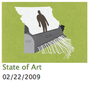
State of Art
It's not that I'm trying to prove that I knew he was cool before anyone else. It's more that I'm trying to prove to myself that I have good taste, and that it was worth it to remember his name.

You see, that original venue was the ill-fated 1000 Markets. You've probably heard of Etsy; 1000 Markets was the same idea, except, well, beautiful. Selling one's wares involved a few hurdles (the site was curated; your product photos had to look good, or you wouldn't be accepted), which ensured that any page on the site looked clean and professional. I loved the way my products looked on 1KM. I loved the way everyone's products looked on 1KM. It became the shop I sent people to, because that's how I wanted them to see my products for the first time.

Unfortunately, it was not to be, and 1KM URLs now bounce to Bonanza. Double-unfortunately, Bonanza is ugly (I actually just poked around after typing that, to see if their site design had improved at all. I thought for a few moments that I was wrong, and they had improved—it didn't look so bad! But then I found the mother of all reasons never to sell my wares there: all-caps extra-large comic sans. In three different colors. Granted, it was an individual seller's shop policies, but it shouldn't even be an option. I didn't go hunting for it; it was the first item I clicked on).

But, back to my impeccable taste. So, Frank Chimera had a shop on 1KM, and I found his art and loved it, and blogged about it in 2009. What I didn't know (until I don't know, today maybe?) was that Frank was also responsible for the beautiful site design of 1000 Markets. Chimero said, "Artisanal selling is the only model of selling things where there's delight on both sides: delight in making, and then delight in consuming. It's a transfer of delight."

It turns out, delight is a bit of a specialty for Frank Chimero. You may have noticed that everything in this post that can be a link is a link, except for Frank's name. That's because I'm making you wait for the delight. His newly launched website, and this other thing of his I found, are absolutely delightful. You need to see them. I promise they're worth the wait.

Picture
But back to my story: so, 1KM was no more, and I couldn't find much on Frank Chimero back then, but I didn't really try that hard. Then this week happened. I read a LifeHacker article about creating your own personal (or professional) landing page.

And there he was. There is no link in the article. There is nothing to indicate that this is Frank Chimero, other than the blurry name in the picture.
As far as I can tell, this personal / professional landing page doesn't even exist anymore—at least not in this form. Then, posted a week later, but it's possible I saw them the same day, was this mention of Frank's newly redone website on Swiss Miss.

So take a few minutes for the delight. (Frank has changed his page. No more delight. Sorry. The link in the next paragraph is still pretty great, though). Scroll down. Slowly. Maybe a few times. Then come back here, because I'm not done showing you the awesome yet. http://FrankChimero.com

Are you back? Are you impressed by that delightful scrolley business? OK, now go here: Frank Chimero's Lost World's Fair: Atlantis. Scrolling all the way to the bottom of a ridiculously long web page has never been so delightful!

There are many interviews with this design master out there, and all of them leave you wanting to be a designer if you're not one already, or to be a better designer if you are. He just wrote a book: The Shape of Design, if you want to delve deeper. This talk he did at the Build Conference is pretty good, too, though I think his audience is a bit of a dud: they don't laugh at his jokes!

One more thing I found impressive, though not at all surprising: almost all of the websites I could find that feature an interview with Frank, or his art, design, or ideas, itself is an example of great design. It's reassuring to see that the people who praise Frank Chimero the most actually know what they're talking about. They recognize great design because they strive to create it themselves.

Below are some of my favorite well-designed sites talking about Frank Chimero:

dConstruct
Humble Pied
idsgn
Kern and Burn
Use This
Emerald Interaction
Thinking for a Living
Quotes on Design
r27 Creative Lab
Grain Edit
Swiss Miss
DO Lectures
Daily Drop Cap
Scout Books
Oh, also The Mavenist is pretty awesome. Frank explains what it is here, using my all-time favorite exchange from The West Wing as an analogy. Can this fool get any better? Oh, wait, he's a Portland boy, so—yes, yes he can.
0 Comments

Day 28 - No Human Being is Illegal

2/25/2012

0 Comments

 
:120225: This photograph of a wall just outside my cell was taken by Desto of Ser Verdadero. Both the photograph and the mural's message deserve to be shared as often as possible.

Muralist Salvador Jimenez created the work with a group of young artists, ages 16-21, as part of the National Museum of Mexican Art's exhibit: A Declaration of Immigration in Chicago, IL. The exhibit featured over 70 artists, all immigrants to the U.S., and was curated by Cesáreo Moreno.
Picture
Though the exhibit and the mural both serve to depict some of the experiences and political struggles of communities of immigrants within the U.S., there is an essential larger message here:

No human being is illegal.

I don't know if you heard me. Let me say that again:

NO HUMAN BEING IS ILLEGAL

No human being is illegal. Please apply that to everything. Always. Any scrap of dignity you feel entitled to for yourself should be given to every human being on the planet. No exceptions. I can think of zero circumstances in which dignity should be denied to another citizen of the planet. Or any other planet, for that matter. No human being is illegal. No human being is illegal. No human being is illegal. Keep saying it until you believe it. Now say it to everyone else.
0 Comments

Day 27 - The Glass Is...

2/24/2012

0 Comments

 
:120224: ...twice as big as it needs to be.

I was sentenced to a bit of time this week sitting in on a few middle school classes with which I soon will be working. As I listened to them discuss complex topics of monumental importance, impressed all the while by their eloquence and compassion, I was reminded of a moment in that very classroom two years ago that blew me away (names have been changed).

Each morning that year, the students spent a period of time writing. Students took turns bringing in a topic or a bit of inspiration (frequently a song or poem that they found particularly meaningful), and the class would set to work writing silently in the mood-lit classroom. After a time (there was no signal, just a feeling that enough time had lapsed), the student who had brought the inspiration for the day would begin reading their piece of writing aloud.

Others subsequently took turns, in no particular order and without raising their hands or waiting to be recognized in any way, reading their piece of writing whenever they were ready. Not every student shared their writing every day. Some wrote a lot, some very little, some only shared a sentence or two of their larger whole. Some students, too shy to share their piece, would pass their notebook to a neighbor to read aloud in their stead. Frequently, students were moved to tears by their own writing, or by listening to the words of their classmates.

On one particular day the inspiration piece included a reference to a glass half-full, or half-empty, I can't remember which. Many of the students' compositions followed that theme of optimism versus pessimism. One particular student, Carissa, began to share her piece.
Picture
Carissa was confident in her writing, and unafraid to share. Her thoughts were organized well enough for a twelve-year-old, but right in the middle of her soliloquy came this:
The glass is not half-empty or half-full;
it is exactly enough water for one life,
and I'm going to drink it slowly.
Her teacher and I exchanged glances across the room. He mouthed "Oh my god!" We both knew immediately that such a powerful statement—such a powerful idea—was one not easily understood by very many adults, let alone humans as young as Carissa.

Her teacher informed me later that part of Carissa's academic history included an IEP, or "Individualized Education Program," specifically for writing. Such programs are tailored to meet the academic needs of a student who struggles in a particular area for a variety of reasons.

It's hard to say when Carissa went from struggling with writing to eloquently expressing such powerful ideas, but a safe, respectful environment in which to share her writing aloud was probably a large part of it. If you ask Carissa, she'd say she wants to be a writer when she grows up.

Never underestimate the capacity of a child to think and express in profound ways. Never underestimate the power of a respectful and encouraging community to let individuals shine.

... makes me want to sit down with a nice cool glass of water. Or maybe half a glass ...
0 Comments

Day 26 - Apparently I'm an Expert

2/22/2012

0 Comments

 
:120222: So there I was in my cell, minding my own business (as usual) when I came across an eHow instructional article. The article itself was rather strange and specific: How to Draw Zodiac Constellations.
Picture
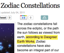
And there I am, cited as an expert in the definition of a Zodiac Constellation. This was, mind you, before I was a published author on the subject of astronomy, which would make me a little bit more of an expert, one would think.

It's nice to know I was considered an expert before I published the book, but it might matter who is considering me the expert.

Not just anyone can write for eHow; there appears to be an application process, and the writers are all paid for their content.  This writer passed somebody's screening process. Demand Studios (content distributor for eHow and other channels) also hires copy editors, who presumably passed somebody's screening process and then checked the work of the writer. And yet...

The instructions were a bit odd. Basically: look at someone else's representation of the constellation. Draw the big stars first, then the smaller stars. Connect the dots. I have a hard time reconciling how these instructions are useful, or how they are appreciably different than instructions for drawing any constellation.

Picture
Another thing Demand Studios pays people for: determining the appropriate category for a particular title. I'm not sure if they desperately need more people for this job, or if their current employees are just terrible at their jobs. The drill-down for this article is Home >> Toys & Games >> Magic, Mystery & Fortune Telling >> Aries >> How to Draw Zodiac Constellations. There has to be a better classification for this! If I were starting from the Home location, there's no way I would follow this path to figure out how to draw Zodiac Constellations. Here are a few that I would try first:

Home >> Arts & Entertainment >> Art Drawing >> Drawing
Home >> Arts & Entertainment >> Art Drawing >> Pencil Drawing
Home >> Arts & Entertainment >> Art Drawing >> Step by Step Drawing
Home >> Arts & Entertainment >> Art Drawing >> Draw to Scale
Home >> Arts & Entertainment >> Art Drawing >> Draw Anything
Home >> Arts & Entertainment >> Art Drawing >> Draw Illustrations
Home >> Arts & Entertainment >> Art Drawing >> Drawing Directions
Home >> Arts & Entertainment >> Draw Shapes & Objects >> Draw Stars
Home >> Arts & Entertainment >> Draw Shapes & Objects >> Draw Stuff
Home >> Hobbies & Science >> Earth & Space Science >> Constellations
Home >> Hobbies & Science >> Earth & Space Science >> Find Stars
Home >> Hobbies & Science >> Earth & Space Science >> Night Sky
Home >> Hobbies & Science >> Earth & Space Science >> About Astronomy

That means the Toys & Games route would be at minimum my 14th try, but I'm guessing I'd never actually get there. I hope they have a better search function than categorization function. While looking through those categories, I found all manner of mis-categorized articles. All of those drawing subcategories should probably have been in "Arts & Crafts" rather than in "Arts & Entertainment," but that aside, when you finally get down to the articles in that first listing, >> Art Drawing >> Drawing, you'll find (almost at the top of the page):

Identify Income Sources You Can Draw From in Retirement
Can I Draw Both SSD & SSI?
What Is a Sales Draw?
How to Increase Your Band's Draw
How to Fix the Draw in a Fireplace

None of which are even obliquely related to Art Drawing. So, I'm thinking I might apply to work for Demand Studios, since I'm already cited as an expert, and clearly I have some skills they need.

0 Comments

Day 25 - You Know You Should

1/23/2012

0 Comments

 
:120123: My captors want you to go back up your data. Right now.

So there I was, sitting at my computer, minding my own business (as usual). Suddenly, a warning box popped up on the screen. Apparently, I had removed a device without ejecting it properly.

Nonsense! There was the drive in question, still attached, plugged in securely. The little light was on. I rested my hand on it and could feel it humming away like a good little external drive that has all of my pictures and music on it. Good as new.

I closed the little warning box. Right behind that window was an identical warning box. I closed that one, too—and there was another one. I probably closed about 40 of these warnings in rapid succession before they were all gone.

And my trusty little drive ceased to exist on the desktop. Unplugged, replugged. Nothing. Time to bring out the big guns.
Picture
I opened the disk utility, and there was my drive, but damaged. The drive could be neither mounted, nor ejected, nor repaired.

I'm really good about backing up my data fairly regularly. In fact, I had just backed it up on December 31st. I have taken lots of pictures since then, though, and I wanted them back.

I wasn't worried about anything from the beginning of time through the end of 2011; all that was safe and backed up already. I just needed 2012.

I found a data recovery program that was extracting data pretty well from my drive and saving it nicely. Awesome. Unfortunately, there was no way to select which data I needed, and it was saving starting at the beginning of time. I didn't have enough free space on any other drive for all of it.

I tried another program. And another. And another.
All of them were either unsuccessful, or they would let me see my data, but only save it if I was willing to fork over $100 - $200. If I had lost everything, $100 would totally be worth it, but I only wanted 20 days worth of data. Can I get that for $5? Each of these attempts took several hours, as I waited for each program to find what it could find from my faulty external drive. I did nothing else yesterday.

I finally concluded that I probably could have spent all day taking some new pictures instead. I wiped the drive, and started over. Now it works just fine. It has been reloaded with its 0-2011 data once again. And I backed it up today, just for good measure.

Pictures I took in 2012, like this chair with the pumpkins, that I wasn't quite satisfied with and wish I could keep editing, are now stuck in this permanent state. I wish I could get that original back and edit it differently. Oh well.

Have you backed up your data today?

Go do it.

Right now.

0 Comments

Day 24 - As Luck Would Have It

1/21/2012

0 Comments

 
:120121: Sometimes, a stint in the exercise yard is pleasant. There was a moment, this fall, when the figurative planets aligned. The end of October was going to bring with it the much anticipated Halloween celebration. Halloween always means much planning, preparation, and time. Time is something we have precious little of.

The biggest time sucker is, of course, the Haunted House. In order to make it deliciously creepy, we needed English Ivy and dried leaves aplenty. But fall happens very quickly. By fall, I mean the actual "fall"—that day, once a year, when all the leaves decide to relinquish their grasp on the trees. It seems as though one day there are only one or two leaves on the ground, and the next day there are only one or two leaves on the trees.

So, in this planet-aligning fall leaf timing scenario, here's what happened: I realized, all of a sudden, that today was Fall; all the leaves had hit the ground. They were also, miraculously, still dry. If you are familiar with the Pacific Northwest in fall (spring, summer, winter), you know that a dry day when you need a dry day is far from a guarantee (outdoor weddings with umbrellas can be charming). In fact, on this particular fall day, it was sunny. So there were all the leaves, just sitting there, still dry and crunchy and crinkly, and perfect for the haunted house still 3 weeks away.
Picture
Ordinarily, this would cause me to pause just long enough to think to myself, "we should really collect some of those leaves while they're still dry," before rushing off to my next task. But on this particular sunny-dry-fall day, I had an entire half hour free. This is unheard-of. Free time is not a thing that happens.

I also realized there were some of our high school volunteers nearby, on "homework time." I knew that not all of them would be taking advantage of that time for its intended purpose, but these high school students are far from lazy. Inspiring Our Next Generation, these Irrationally Benevolent individuals are an Outstanding Volunteer Group. These folks are up for doing anything that benefits the program they love. We enjoy being brutally honest with them when requesting help for something unpleasant: "Who wants to help me carry something heavy and awkward uphill through some mud?" There are always more volunteers up for the task than the task requires.

Put all this together: Dry Fall Leaves. Sunny Day. Half Hour Free. Several Enthusiastic Helpers.

In 20 minutes, we had 10 huge garbage bags full of leaves for haunted house ambiance, stored under a building until they would be needed in three weeks.

I tried editing this photograph, because it has such interesting colors, but I wasn't able to do anything to it that I liked better than the original, straight out of the camera. Love that Acer.
0 Comments

Day 23 - Hassle Free Holiday Light Storage

1/11/2012

0 Comments

 
:120111: My captors have already packed up their lights for the year, but this trick will be useful for next year.

I don't know what made me try this in the first place 15 years ago, but now I would never store strings of lights any other way.

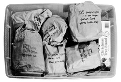
In 15 years, I have never had a string of lights tangle, and I can find the specific string I'm looking for the first time, every time. This system cost me $2.99. Once. 15 years ago. Ready for the secret? Lunch-sized paper sacks. Buy one package of them and keep them with your holiday decorations. You'll still have some left over in a few decades.

Put each strand of lights in its own paper sack. Feed the lights in like you're stuffing a sleeping bag into a stuff-sack, don't roll them up or fold them or bunch them first. This is part of the secret. Start with the non-plug end at the bottom of the sack, so the plug always comes out first.
Picture
Need to test a light strand? No need to remove it from the sack, just pull out the plug end a few inches and plug it in. Don't worry about a fire hazard, the lit lights won't be in the sack long enough to matter. In 15 years, I've never had a sack even start to get brownish from lit lights.
Picture
Picture
Another brilliant aspect of this system is easy labeling. I always include on my sacks:

1. Number of lights in the strand
2. Color of bulbs
3. Color of cord (green looks good on the tree, white looks good against white walls)
4. "Plugs one end" or "Plugs both ends" for decoration planning purposes
5. Any other distinguishing characteristics (like "LED" or "icicle style" or "faded color" or even how you typically use them, like "goes above the fireplace")

You can fit a remarkable number of these paper sacks full of lights into a large plastic tub, with other holiday decorations or by themselves. The sacks are also conveniently squishy, so you can really pack them in to any available space.

Next year when you pull them out, you'll know exactly what you've got without even opening any sacks. Throw away (or recycle) all those stupid plastic clips and cardboard boxes the lights came in but never fit back into. One flimsy paper sack will last for many years (I use the same ones over and over again. I've replaced a few over the years, but not many; the sacks tend to last longer than the lights themselves).

One more bonus: decorating the tree is easier. Pull out the plug end and plug it in. Keep the sack full of lights in your hand as you walk around the tree, feeding out only as much of the strand as you need for that part of the tree. The tail end of the strand won't get caught on lower branches, or, you know, the cat. Work in reverse to take the lights down.

0 Comments
<<Previous
    Picture
    Picture
    "A human being is part of a whole, called by us the 'Universe,' a part limited in time and space. He experiences himself, his thoughts and feelings, as something sepa- rated from the rest—a kind of optical delu- sion of his consciousness. This delusion is a kind of prison for us, restricting us to our personal desires and to affection for a few persons nearest us. Our task must be to free ourselves from this prison by widen- ing our circles of compassion to embrace all living creatures and the whole of nature in its beauty."
                                                         - Albert Einstein


    Categories

    All
    Amicus
    Antecessor
    Antiqua
    Caelum
    Calculo
    Cognatus
    Discipulina
    Existimatio
    Festum
    Ire Maior
    Librorum
    Lucus
    Obcupatio
    Prosapia
    Respublica
    Scientiam
    Spectaculum
    Stadium
    Volgus

    Archives

    July 2012
    March 2012
    February 2012
    January 2012
    May 2011
    March 2011
    February 2011
    November 2009
    September 2009
    January 2009
    November 2006
    August 2006
    March 2006
    February 2006
    January 2006

    RSS Feed

    Day 32 - Olympic Design
    Day 31 - Just a Little Shak
    Day 30 - Neil DeGrasse Tys
    Day 29 - State of Design
    Day 28 - No Human Being I
    Day 27 - The Glass Is...
    Day 26 - Apparently I'm An
    Day 25 - You Know You Sh
    Day 24 - As Luck Would Ha
    Day 23 - Hassle Free Holid
    Day 22 - 9 Weeks Away
    Day 21 - The Catfish Know
    Day 20 - Divided by Two
    Day 19 - Catch Rays on the
    Day 18 - The Power of the
    Day 17 - Stuck to the Glass
    Day 16 - Stay for the Georg
    Day 15 - A Place to Put His
    Day 14 - The View From Be
    Day 13 - Color Geek
    Day 12 - Minor Celebrity
    Day 11 - We've Been Waiti
    Day 10 - Obtuseness Abou
    Day 9 - From the List
    Day 8 - Wearing the Right
    Day 7 - I Heart the Olympic
    Day 6 - Back When
    Day 5 - Natural Selection a
    Day 4 - Priorities
    Day 3 - Epilogue
    Day 2 - Freefall
    Day 1 - Secret Treasure
Powered by Create your own unique website with customizable templates.